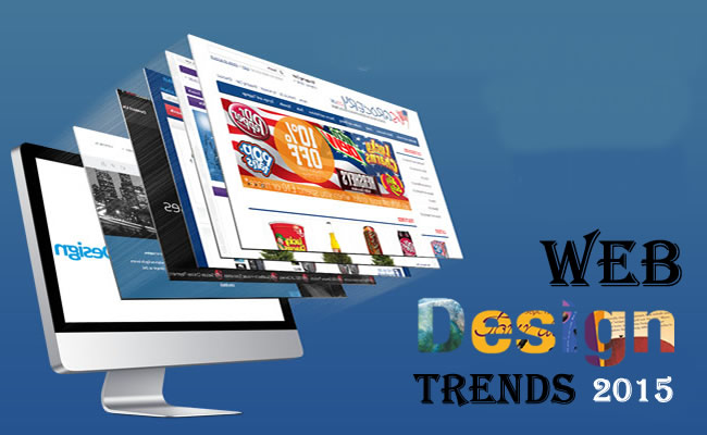
10 Web Design Trends To Expect in 2015
- //
- Home
- |
- 10 Web Design Trends To Expect In 2015
- |


10 Web Design Trends To Expect in 2015

Web design is a never ending process. It keeps on growing and tremendous things are published on daily basis. Trends keep on changing every now and then. Let’s have a look at some of the web design trends which will be encountered in 2015.
1. Long scrolling sites
Most of the new websites’ designs published nowadays are lengthy while scrolling through the page. The popularity of mobile has made the sites to choose scrolling over linking. This results in displaying the content on their home pages. The user gets all the information by simply scrolling down instead of clicking. Long scrolling trend is not just limited to homepages but also in about us and product page sections.
2. Interaction and storytelling
Undoubtedly having amazing content is crucial for a website but being able to narrate a story is an added advantage. In 2015 web design will focus on helping “tell a story” for users. Interaction and animation when tastefully done in website designing can make it look splendid.
3. No large header background images
Over the last few years large header background images have been trending with text at the top. It is the first thing viewed by the visitors when they visit the website. If you want to be unique then do exactly the opposite. You can keep your headers large but make the background image free.
4. Remove non essential design elements
In 2015, websites will remove non essential design elements and keep it simpler. Designers would get rid of many design decisions that most current websites have like several images, background colors, and stylish layouts. Instead a simple website design would be opted.
5. Fix width centered site layout
Over the past few years most of the websites have used the width 100 percent, so that sections images visually stretch the full width of a browser. Prior to this trend most sites were centered in the page and had fix width. This “fix width” trend is making a comeback. Some sites are opting for a max width so their content remains centered in the viewport.
6. Professional custom photography
Professional photography of high quality has surpassed stock imagery these days. Custom photography is appreciated more than picking stock imagery. It makes your website look unique since those images are present only on your website.
7. Flyout app-like menus
Responsive web has gained importance recently due to the new Google Mobile Friendly update. The idea of bringing an app like and responsive menu to entire site is pursued. Instead of the typical horizontal menu on the top of the page, you can either opt for a vertical menu on the left or right side of the page.
8. Hidden menus
When the visitors visit the site the menus are kept hidden and they become visible only when the visitor is ready to move on and click the appropriate icon. This is also a technique of mobile friendly design that is carried over into all of a site’s design instead of just small viewports.
9. Large typography
In 2015 large headings and typography will become important and get even larger. It is aimed at making a visual statement that couldn’t be missed. It is a way to enhance the visual hierarchy by ensuring the page visitors read the largest type of page first.
10. Performance and speed
Some design make the websites load faster and consume less bandwidth. The trends discussed in this article came out of the need to reduce the size of the site and find ways to load quickly. The weight of the site and how users interact with them is considered.
These concerns are reduced by Responsive Web design. Slow internet speed and similar factors have forced developers and designers to pay close attention to the size of their files and sites. The need to be faster and perform impeccably without lagging in time will drive design decisions on many new websites launching in 2015.
Our Blogs
Maximize SEO Performance by Using Automation
12th Mar 2019Enhance Your Business SEO With Voice Search
5th Mar 2019Novel Ways to Grab the Attention of Your Audiences
12th Feb 2019Mistakes to Consider About Rank Tracking
23rd Jan 2019
How can we help you?
Save your valuable time and money in just one click with us. We are ready to help you accomplish your entire digital business needs effortlessly and cost-efficiently.

